A good band logo goes a long way. It’s a visual token that fans instantly recognize and connect with your art on a subconscious level. But crafting a logo that’s both eye-catching and representative of your identity can be a hefty challenge. That said, here are some valuable tips to guide you in designing a compelling band logo.
1. Define the feel.
Before you do anything, lay out some visual adjectives you would use to describe your dream logo. Bold and brash? Curly and delicate? Grungy and eroded? Bright and pink? The Beach Boys logo does a great job at conveying the bands smooth and melodic sound through its flowing letters reminiscent of an inviting hop or diner. Take a look at well-established artists within your genre for inspiration. Once you have an idea, you can start to sketch ideas or search your favorite font website for a free-use or affordable typeface that best represents your sound. Most offer categories to help you narrow down your search. Even better, make some custom changes to the letters, or add in extra elements to really make it your own. And of course, a signature color palette does wonders for branding.

2. Establish a theme.
Sometimes the above tip simply isn’t enough. Trying to put a visual representation on music can feel sort of like trying to paint a picture of a particular smell. The two mediums don’t always have a direct correlation, and it it may take a little brainstorming to settle on a creative direction. The (sometimes too) obvious place to start is if the band name has a word that already plants a visual in the listeners’ brains. Or maybe a song title or lyric has an element that can be illustrated in a compelling way. AC/DC manages this through the use of a simple bolt of electricity in place of the forward slash. While this tip may not work for all artists, it’s certainly worth exploring.

3. Explore visual relationships among letters.
This one may not be as straight-forward as some of the other suggestions, but if executed properly can have a big impact. Look closely at the letters within your project’s name. Write them on a piece of paper or type them onto a blank file and really look at how they sit together. Then try to come up with a unique and eye-catching arrangement. The Who’s logo is a great example, featuring a design that connects the two H’s in the band’s name. Nine Inch Nails took a different approach by abbreviating the name and reversing the last N, giving it a mirrored effect. Just like with our first tip, scrolling through different fonts can help spark the creative flow. Try using all capital letters, or even all lower-case ones for even more options.

4. Embrace simplicity.
Less is often more in the world of logo design. And while there can be exceptions to this rule (such as those cool but nearly illegible metal band logos), it’s usually a better idea to think sleek with clean lines. In today’s digital world, thumbnails are often how fans browse music as they decide what to listen to, and highly detailed images simply don’t scale down as cleanly. Keeping a keen focus on simplicity ensures versatility and clarity across multiple mediums. Sometimes all it takes is a simple but strong typeface, as can be seen with Nirvana’s choice of font.

5. Factor in printing considerations.
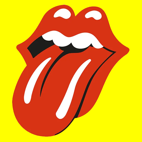
As your band gains traction, your logo will adorn merchandise and promotional materials. Making sure your image is a high quality vector file with a transparent background will help printers immensely. Also, as mentioned above, how a logo scales is vital. And if you plan to sell t-shirts or anything that involves screen printing, every single color will make the job more expensive. If you can pare it down to one or two colors (not including a background), it’ll save you money in the end. The famous Rolling Stones emblem – featuring a pair of red lips with a tongue protruding from the mouth – can be printed on a t-shirt using only two colors, assuming the shirt’s base color is white, black, or red.

6. Don’t be afraid to outsource.
If visual art isn’t your forte, that’s fine – it doesn’t have to be. Countless eager artists with diverse skills are prepared to take on the job. While it’s true you can find these services on Fiverr, we recommend you do a little research to find an artist that best clicks with your band’s identity. Instagram is a great place to start, but we also work closely with Stevan of Hass Productions, a budget-friendly graphic designer who does quality work across various styles.